
Increasing Website Foot Traffic
3rd Shot Pickleball - Q1 2025 - 3 weeks
My Role
Product Designer, UX Researcher
TL;DR
I led a website redesign for 3rd Shot Pickleball to address critical usability issues that were causing users to abandon the site in favor of third-party booking platforms.
Through competitor research and usability testing, I identified key pain points—unclear navigation, buried pricing information, and inefficient task flows. The redesigned site improves clarity, reduces friction, and better supports user needs across core booking flows.
The streamlined experience raised the System Usability Score (SUS) from a very low 27.5 to an excellent 85.5.
See results below.
If you're interested in the details behind the redesign, there's a full breakdown of my research, process, and decisions in the sections following the results.

The Problem
The current website design poses significant challenges that negatively impact the user experience. Users struggle to navigate the outdated pages, which hinders their ability to interact with the site effectively. This was reflected in a System Usability Score (SUS) of just 27.5, well below the industry benchmark and indicative of critical usability issues.
As a result, 60% of users bypass the website altogether and rely on third-party services to make reservations. This not only causes 3rd Shot Pickleball to lose valuable website traffic but also leads to lost revenue, as users are unable to easily book services directly through the site.
Discovery
We began by examining competitors and testing the existing experience to better understand user challenges and uncover where the design could be improved.
Competitor Analysis
Conducted a competitor analysis between four indoor pickleball facilities: Epic Pickleball, Pickleball Food Pub, Mile High Pickleball, and Pklyn and determined that most websites contain minimal design and information making it difficult for the user to complete desired tasks.
Competitor Weakness: Too much information and no easy way to find pricing

Competitor Strengths: Easy to follow pricing structure and icons that explain facility offerings

Usability Testing
We conducted a Usability Test using five participants. Three of the participants are avid pickleball players, while two don’t play the sport.
This provided variety and allowed us to test the functionality of the website for users familiar with the site and new users trying to navigate it.
We looked at three flows to identify efficiency and usability: (1) Price Offerings (2) Court Reservations (3) League Sign-Up
Participants average System Usability Score (SUS) was 27.5
As a rule of thumb 68 is the average SUS Score, considered to be 50th percentile.
4 out of 5 participants were not able to find pricing for court reservations or leagues
“I would have never found the league portal on my own. If it wasn’t for a friend signing us up, I would have given up on joining a league.”
All participants found the website cumbersome, with too many clicks required to find the information they were seeking.
“Why do I have to click into each tier to see the pricing for private lessons. I want to easily compare prices!”
None of the participants would recommend the website to a friend
“I wouldn’t put my worst enemy through that site. I just send friends the Court Reserve link.”
Solution
Users want a seamless and cohesive experience on the website, where they can easily find everything they need without confusion.
I want to explore ways to improve the site’s layout and flow, ensuring intuitive navigation that provides a smooth and enjoyable user journey.
*** There's much more that goes on between research and hi fidelity prototypes. I'm happy to do a deep dive into my process upon request.
The website redesign focused on three key components:
1) Revamping the Information Architecture (IA) to create seamless and intuitive navigation
2) Redesigning the homepage layout to enhance clarity and improve user engagement
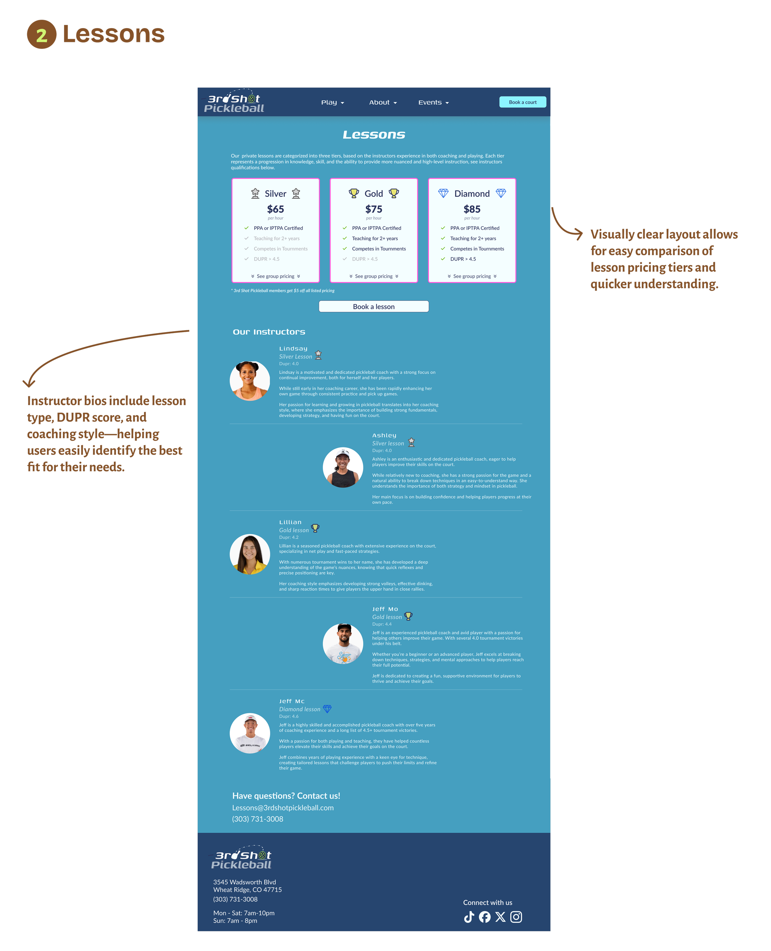
3) Optimizing the Lessons and League pages to simplify content and streamline task completion.
*See below for a detailed explanation of each step
1) Revamping the Information Architecture (IA) to create seamless and intuitive navigation
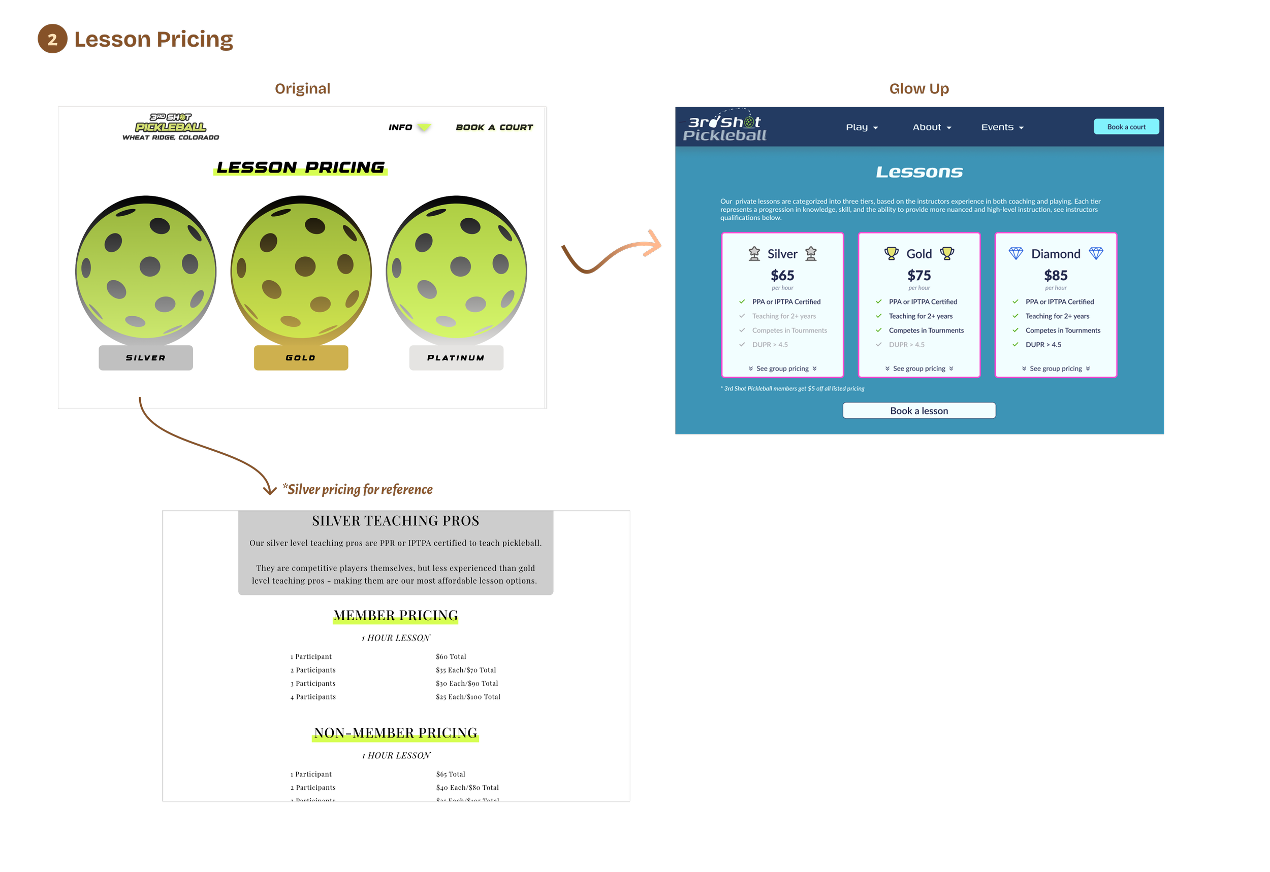
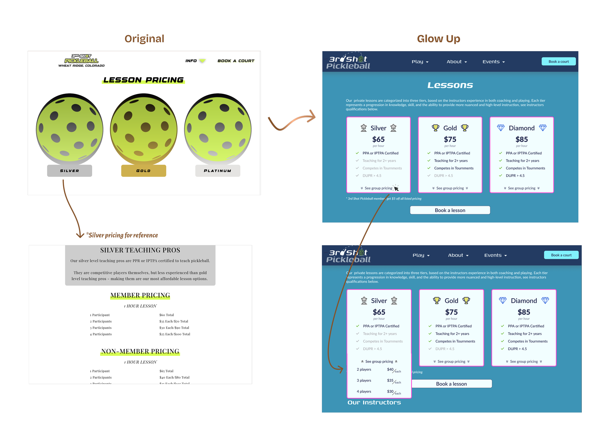
As an example, take a look at the updated user flow for Private Lesson pricing. Previously, the user had to click into each tier (Silver, Gold, and Platinum) to see the pricing. The updated flow only contains one click to see pricing for all three tiers (Silver, Gold, Diamond). Making it easier for the user to see and compare prices.

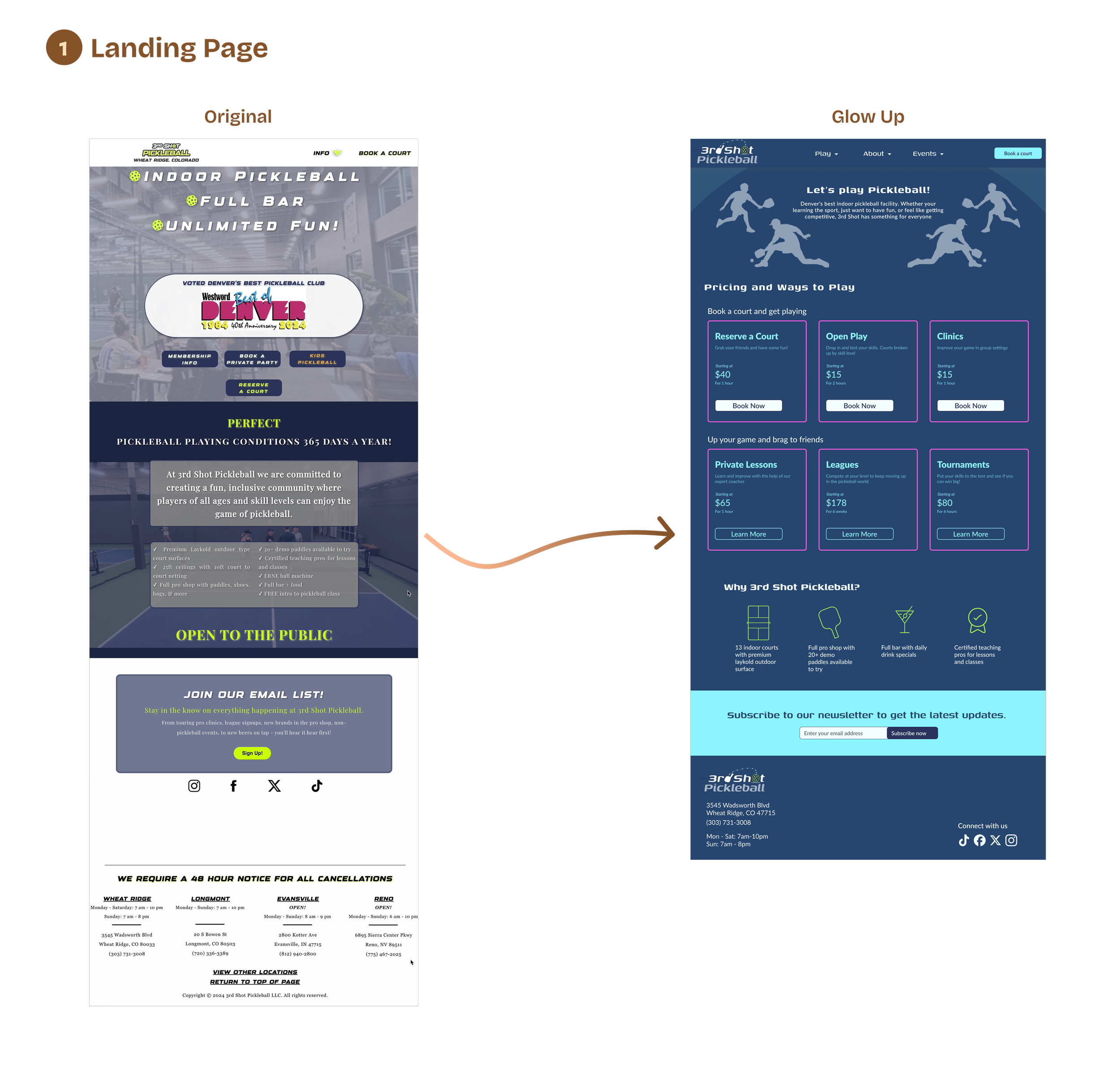
2) Redesigning the homepage layout to enhance clarity and improve user engagement
The updated layout includes pricing directly on the homepage, making it easier for users to find at a glance.
While the core content remains consistent with the original, the new structure improves clarity and flow. Icons were added to help users quickly identify available amenities.
Original
Glow Up
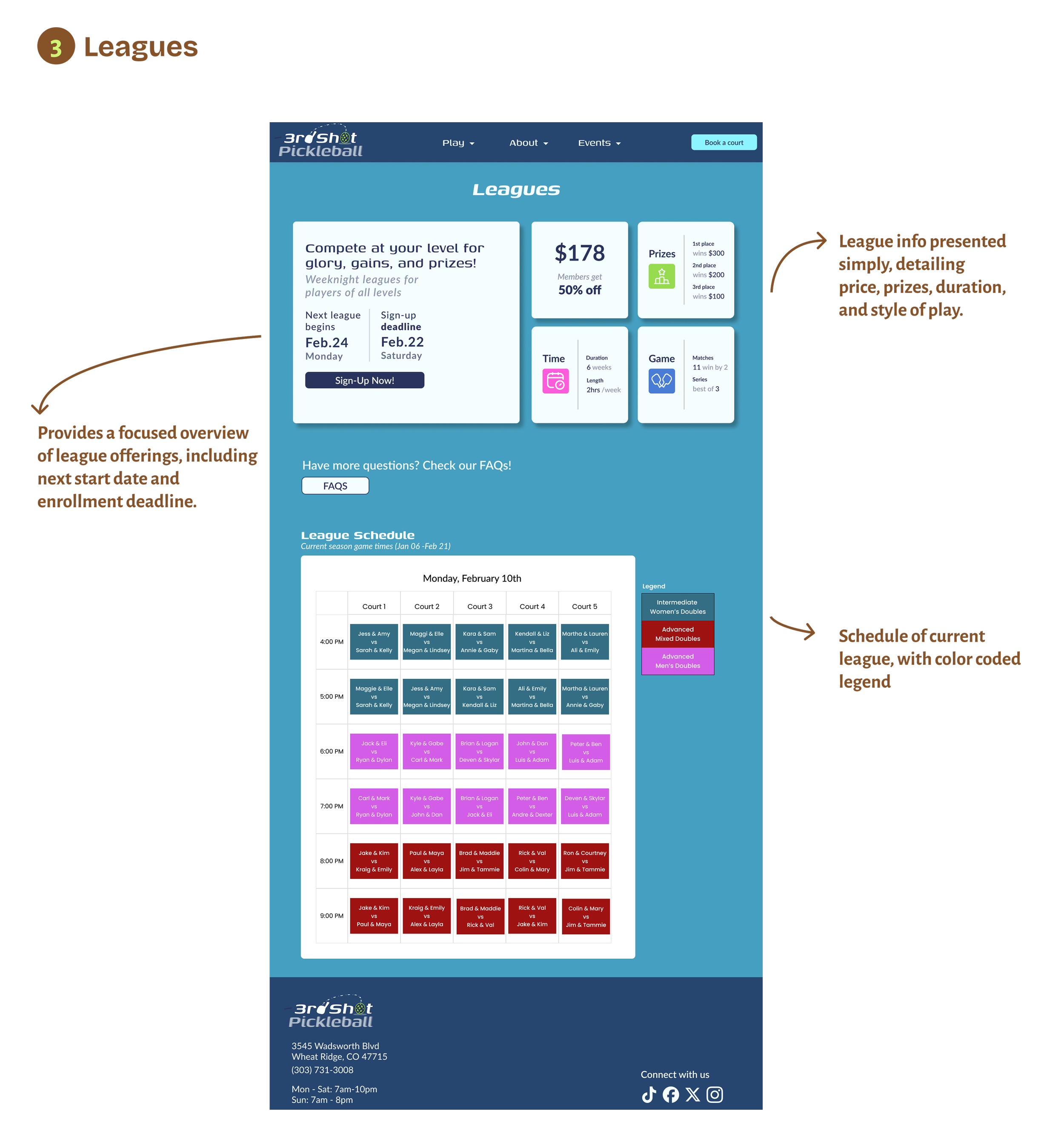
3) Optimizing the Lessons and League pages to simplify content and streamline task completion.
System Usability Scale

From Friction to Flow
An overview of the new, streamlined user journeys with quick insights into the improvements

Conducted a usability test for the website redesign using five participants. Three of the participants performed the usability test for the original website, while the other two are pickleball players familiar with the website.
This enabled us to test the website's functionality with users who are familiar with it, resulting in valuable recommendations and feedback.
100% of users said the layout of the homepage was concise and easy to follow.
86% of users enjoyed the simple flow of the website; minimal clicks to perform desired tasks.
The updated, user-friendly website will drive increased revenue by making it easier for users to navigate. Once on the site, they'll have a clearer view of additional options, leading to higher likelihood of exploring and purchasing more services